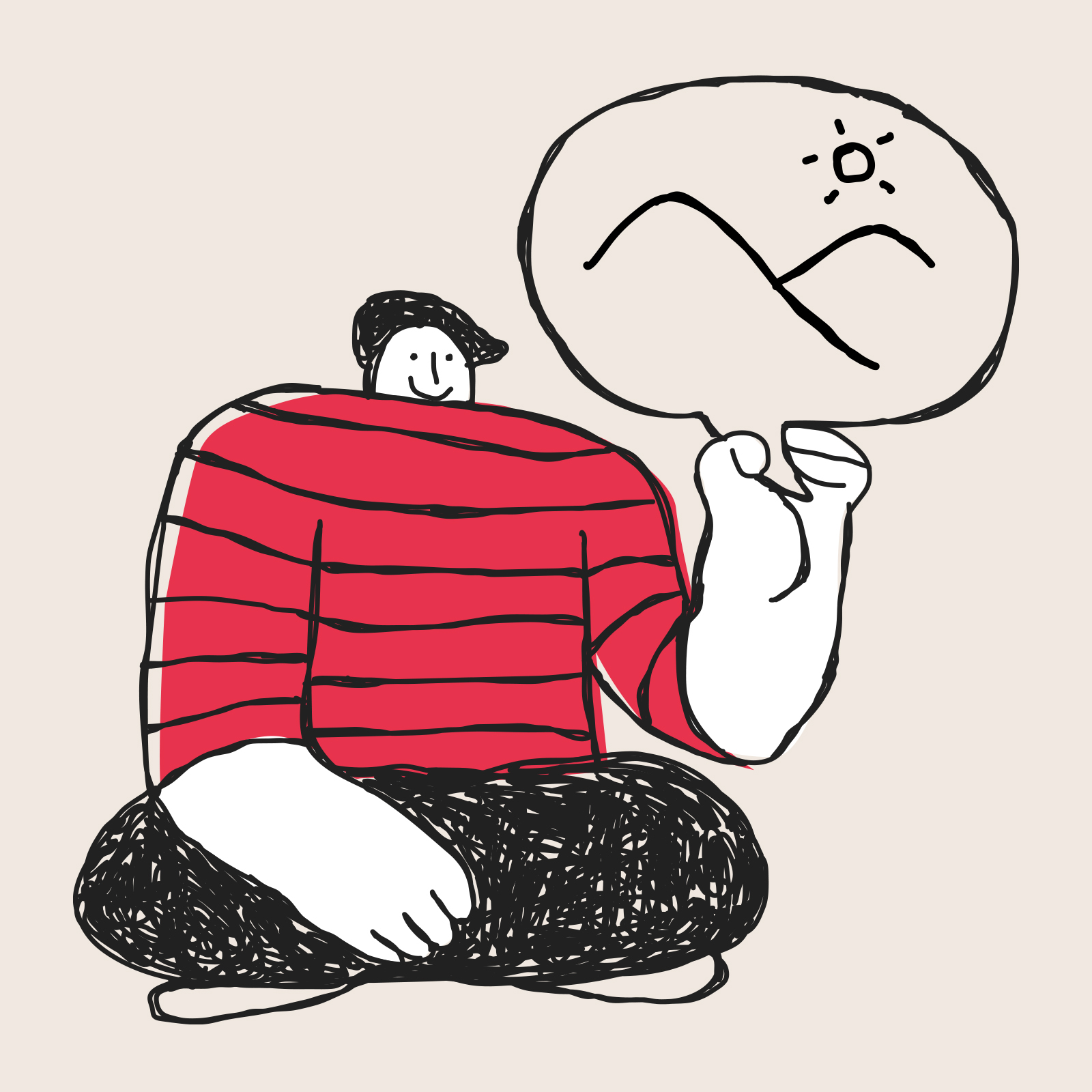
This issue, we’ve been thinking about visual storytelling and how brands communicate before a word is read, and how quickly that influences perception.
We’re also always looking beyond our own work, keeping an eye on the wider world of design and brand, and sharing what stands out to us along the way.
I hope you enjoy this issue. 👀
What's caught our attention...
How heritage can feel alive again
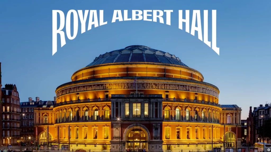
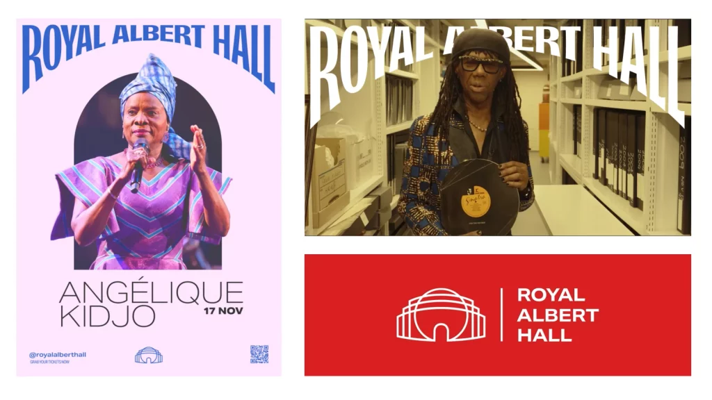
The Royal Albert Hall rebrand by Brandpie caught our attention as a strong example of what happens when one idea is carried through consistently.
It starts with the building itself. Its distinctive dome, arches and architectural details. These elements become the backbone of the identity, with the masthead wrapping around the form to bring the name and the place together.
What stood out to us is how clearly everything connects back to that single idea. Nothing feels added on. Every element has a reason to be there.
It’s something we’ve found ourselves coming back to in our own work. When there’s one strong idea at the centre, decisions become simpler and the outcome feels more confident.
The typography draws from its Victorian roots, while the photography and motion bring it up to date. It holds both a sense of heritage and relevance.
The colour palette is stripped back to a signature red, supported by black. Nothing competes for attention.
What stands out is the intentional use of every element. Everything is set up to give space to what matters, so the focus stays on the artists, the programme and the overall experience.
A simple idea, clearly expressed, rooted in heritage, brought clearly into the present.
2. Now look at your visual identity Your website, social media, emails, or anywhere your brand exists.
– Is it creating those feelings? – Where is it working well? – Where could it be clearer?
3. What actions do you need to take? Is this something you can refine yourself, or would a designer help? 👋
What’s one step you can take this week?
What’s inspired us...
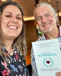
For the Love of Networking
I met up with John Harvey from The Samphire Club last week.
He gave me a copy of his book For the Love of Networking’ and one idea has stayed with me:
“Your network is your greatest asset”
Relationships grow through showing up, taking an interest, and giving first.
Fancy a read? You can order a copy of For the Love of Networking here
What we've been up to...
In and out of the studio
Ongoing brand and website work, with a continued focus on clarity, structure and ease of use.
Animation storyboarding Planning a series of employee engagement animations for a large organisation, focused on helping people access the support available to them.
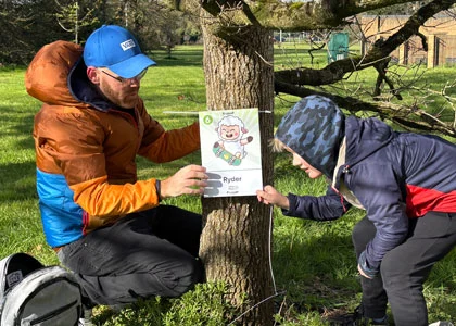
Setting up a school Easter trail Designing and installing a set of cheeky lambs, and creating a trail map for our son’s school 🐑
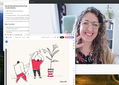
Visual storytelling workshop Clair recently ran an online workshop for a community of healthcare business owners, exploring how their ideas come across before a word is read.
Greyson Perry Exhibition A visit to the exhibition in Exeter. A strong reminder of how powerful clear, distinctive visual language can be.
Find Out More
A final thought...
People feel something before they begin to understand it.
Start with that feeling you want to inspire and everything else becomes easier.
Always aiming to surprise and delight with our ideas, we pride ourselves in presenting well crafted creative that sets you apart from your competition.
Haycraft Creative The Hive 6 Beaufighter Rd Weston-super-Mare BS24 8EE


Leave a Reply